In the IELTS Writing test, you should always spend about 5 minutes to study and comprehend the diagram in Task 1 before you begin writing.
This is because the answer you write in IELTS Writing should present, highlight, and illustrate key features from the image appropriately and accurately. In addition, there should be a coherent structure to your response rather than just recounting details mechanically without any logical relationship between ideas.
Therefore, there are certain facts you need to be crystal clear about before starting writing your answer. There are several things to consider which are covered in this IELTS Writing Task 1 tutorial. Only begin writing once you figure out the three things discussed below.
Understanding IELTS Writing Task 1: What is the diagram about?
This is a straightforward question, but its answer may not always be easy. The graph you get may deal with information about people, products, places, or properties.
To begin our IELTS Writing Task 1 tutorial, look at the following question:
WRITING TASK 1
You should spend about 20 minutes on this task.
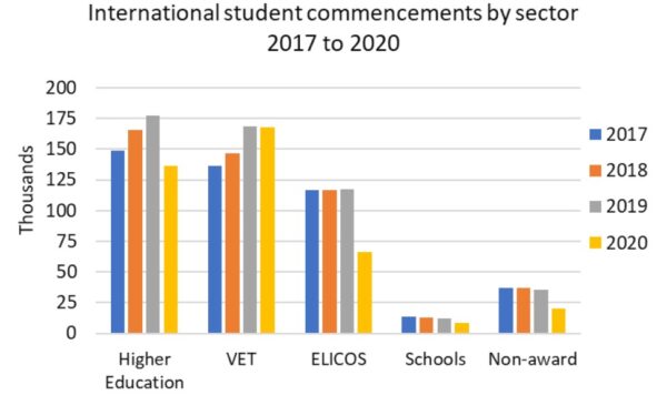
| The chart below shows the number of international students in Australia graduating from various types of programs from 2017 to 2020. Summarize the information by selecting and reporting the main features, and make comparisons where relevant. |
Write at least 150 words.
There are three things which help you understand what the image is about.
First, in the question paper, above the diagram, you will notice a box. The text in the box gives you a short introduction to the diagram.
“The chart below shows the number of international students in Australia graduating from various types of programs from 2017 to 2020.“
Second, most images have a title. In the above question, the title of the bar graph is “International student commencement by sector 2017 to 2020“.
Third, the image itself is designed to be understood by any high-school educated person. It is unlikely that you get enigmatic or unfathomable diagrams which require specialized knowledge. You can look at the horizontal and vertical axes (X-axis and Y-axis), the bars, the time period, etc. to extract valuable information.
So, we can deduce the following things from the above question:
- The bar graph represents the number of international students in Australia.
- It shows how many of the students graduated from five types of courses.
- We can compare the number of students in each course for four different years.
- We can also compare the number of students in different courses in each year.
Look at another question below in order to know more about IELTS Writing Task 1 tips and tricks:
WRITING TASK 1
You should spend about 20 minutes on this task.
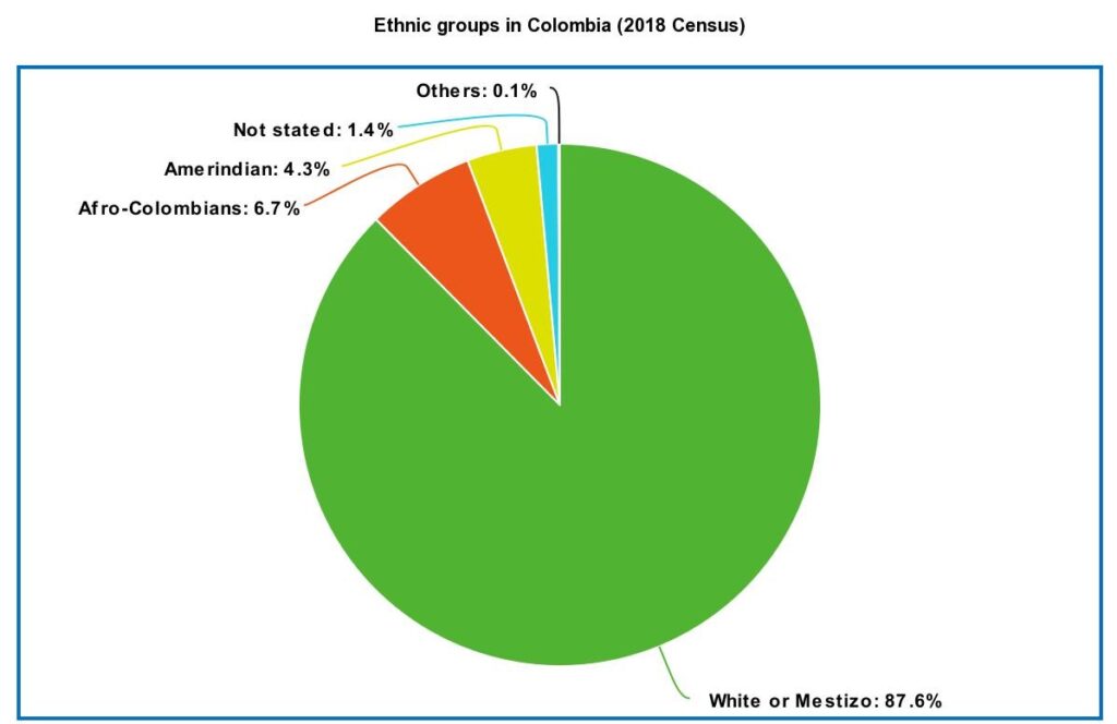
| The pie chart below shows the percentage of different ethnic groups in the population of Colombia. Summarize the information by selecting and reporting the main features, and make comparisons where relevant. |
Write at least 150 words.
Decide whether the following statements are True or False based on the above question:
- The pie chart shows the breakdown of the American population by race.
- The pie chart provides information about the ethnic demographics of Colombia.
- There are three main racial groups in Colombia.
- The data is based on 2021 census.
Click to reveal answer »
1. False, 2. True, 3. True, 4. False
IELTS Writing Task 1 Tips and Strategies: What is the unit of measurement?
Although finding the unit of measurement in a statistical graph is not complicated, many times a lack of concentration results in mistakes.
The data presented in the diagram might be expressed in terms of numbers, percentage, dollars, kilometers, and so on. Failing to write the unit of measurement alongside figures or using the wrong one may lead to the entire answer being incorrect.
Look at the following question:
WRITING TASK 1
You should spend about 20 minutes on this task.
| The line graph below shows the value of imports into Greece between 2015 and 2020. Summarize the information by selecting and reporting the main features, and make comparisons where relevant. |
Write at least 150 words.
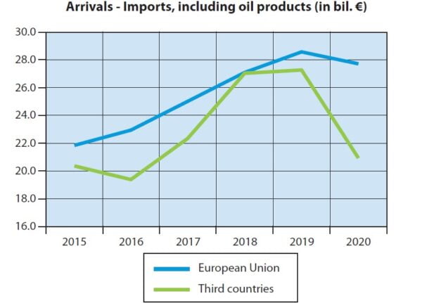
In this chart, the data, which is plotted against the vertical axis (Y-axis), is given in terms of billion euros. So, when describing data, it is vital to mention the unit of measurement as follows:
- In 2015, Greece imported 22 billion euros worth of goods from the European Union.
- Between 2015 and 2016, imports from third countries into Greece had fallen by approximately 1 billion euros.
- Compared to imports from non-EU nations, Greece had imported around €7 billion more from the European Union in 2020.
However, the following statements are incorrect due to errors in using the unit of measurement:
- Throughout 2017, Greece’s imports from the European Union had increased from 24 to 26 euros.
- Greece had imported 27 billion from third countries in 2018.
- In 2020, slightly less than 28 percent of imports into Greece was from the EU.
- $21 billion worth of goods were imported by Greece from outside the EU in 2020.
The four incorrect sentences from above will not only reduce your score for failing to be accurate but might also result in miscommunication of message and thereby rendering your entire answer inappropriate.
The data in a pie chart is almost always expressed in percentage form even if it is not explicitly mentioned. Although pie charts could also provide data in angles (degrees), it is highly improbable that such pie charts are used in the IELTS test.
Here is another graph:
WRITING TASK 1
You should spend about 20 minutes on this task.
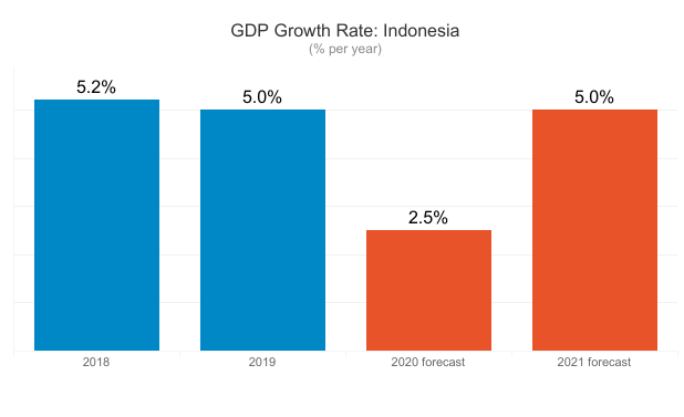
| The chart below shows rate of growth of gross domestic product in Indonesia in 2018 and 2019, and also the prediction for 2020 and 2021. Summarize the information by selecting and reporting the main features, and make comparisons where relevant. |
Write at least 150 words.
Decide whether the following statements are True or False based on the above question:
- The Indonesian economy grew by 5.2 percentage in 2018.
- The GDP growth rate had dropped by $2 billion in 2019 compared to 2018.
- GDP of Indonesia had decreased from 2019 to 2020.
- Indonesia’s GDP had been forecasted to double from 2020 to 2021.
Click to reveal answer »
1. True, 2. False, 3. False, 4. False
Is the information static or dynamic?
How to understand IELTS Writing Task 1 image?
One final analysis, and probably the most important, is to differentiate between static and dynamic graphs.
Basically, there are two ways of describing data in IELTS Writing Task 1 questions. Which one to use depends on this question of static or dynamic.
Static graphs
A static graph presents data for only one time period. It is snapshot of statistical information at one specific date and time.
Look at this table:
Population of Indonesia in 2019 (in thousand persons)
| Male | 48 369 |
| Female | 48 115 |
| Total | 96 484 |
The table gives information for only one year: 2019. From the table, we cannot make out any trend such as whether the population had increased or decreased from previous years. Such graphs, which provide information for only one time period, are static.
In static graphs, we can only analyze whether the numbers are bigger or smaller than each other. For example, we can see from the above table that the male population had outnumbered the female population in 2019.
Dynamic graphs
On the other hand, a dynamic graph displays data for more than one time period. It highlights the trends (or movements) in data, and we can understand whether the data has increased, decreased, or remained constant.
Here is the table from earlier but with added information:
Population of Indonesia 2016-2019 (in thousand persons)
| 2016 | 2017 | 2018 | 2019 | |
|---|---|---|---|---|
| Male | 45 686 | 46 334 | 46 978 | 48 369 |
| Female | 46 986 | 47 247 | 47 688 | 48 115 |
| Total | 92 672 | 93 581 | 94 666 | 96 484 |
This table describes data for four different years: from 2016 to 2019. Here, we can notice the trend, i.e. increase or decrease, in the data presented. Such graphs, which demonstrate information for multiple time periods, are called dynamic.
In dynamic graphs, together with perceiving which figures are big and which are small, we can also work out whether the numbers are rising or falling over time. For example, we can clearly notice from the above table that population in Indonesia had continued to grow steadily from 2016 to 2019.
Static vs dynamic: IELTS Writing Task 1 Tutorial
Look at the following charts and decide whether they are static or dynamic:
Click to reveal answer »
Static
Click to reveal answer »
Dynamic
Brazil Poverty Rate 2013-2018
| Year | Poverty rate (%) | % change on previous year |
|---|---|---|
| 2018 | 4.4 | 0.00 |
| 2017 | 4.4 | 12.82 |
| 2016 | 3.9 | 21.88 |
| 2015 | 3.2 | 18.52 |
| 2014 | 2.7 | -12.90 |
| 2013 | 3.1 | -16.22 |
Click to reveal answer »
Dynamic
Click to reveal answer »
Static
Next lesson:
Gaurav Thapa is an experienced instructor of English as a Foreign Language. He has eight years of experience teaching IELTS and PTE.
very useful
I am glad that I could be of help.
Its clear we can see the Author’s hardwork..
Great job..
Thanks for the compliment Bishal.
Insightful! The teacher’s awesome
Thank you for this awesome comment.