The main part of our answers for IELTS Writing Task 1 questions is the description.
Based on the format we have been learning here, description of data is the final piece of the answer. It is here in this part, we demonstrate our English composition ability by accurately and comprehensively reporting facts.
In some respects, describing graphs in IELTS Writing Task 1 is similar to statistical reports published in newspapers.
| Parts | |
|---|---|
| 1. Introduction | A short paragraph describing what the image is. |
| 2. Overview | A short paragraph summarizing the overall trend from the image. |
| 3. Description | One or more paragraphs reporting on the data or features of the image. |
IELTS Writing Task 1 Description: Two types of graphs
How to go about with the description of data relies upon which type of graph we have at hand.
If the information is static, we describe the biggest and the smallest factors from the graph. By contrast, we focus on the increase or decrease of numbers in dynamic graphs.
To revisit the differences between static and dynamic charts, click here »
Unlike the overview paragraph, where we avoid mentioning numbers, we must include the raw numbers in the description to support our analysis of the graph.
IELTS Writing Task 1 Describing data for Static Graphs
Look at the following IELTS Writing Task 1 question:
WRITING TASK 1
You should spend about 20 minutes on this task.
| The table below shows the total number of branches of banks and financial institutions in Nepal in 2019. The graph shows the ten districts in Nepal having the highest number of bank branches in 2019. Summarize the information by selecting and reporting the main features, and make comparisons where relevant. |
Write at least 150 words.
Number of branches of banks and financial institutions in Nepal, 2019
| Financial institutions | Number of branches | Share (%) |
|---|---|---|
| Commercial banks | 3585 | 41.27 |
| Development banks | 1267 | 14.58 |
| Finance companies | 205 | 2.36 |
| Microfinance institutions | 3629 | 41.77 |
| Total | 8686 | 100 |
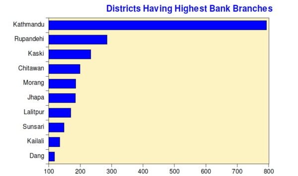
Like we have learned earlier, for static graphs like this, we need to concentrate on the biggest and the smallest numbers to describe. We can ignore other information.
Hence, the following features should be included in our answer:
- Commercial banks and microfinance institutions have the largest number and share of branches in Nepal.
- Finance companies have very few branches compared to others.
- Kathmandu district has the highest number of branches.
- The district of Dang lies at the bottom of the chart in terms of bank branches.
| IELTS Writing Task 1 sample answer: |
|---|
| Introduction: The table provides information about the number of outlets of different types of financial establishments in Nepal in the year 2019. The bar chart sheds light on the distribution of those outlets in various parts of the country. Overview: Overall, in 2019, an overwhelming majority of individual financial centers of Nepal were either commercial banks or microfinance institutions. Similarly, Kathmandu district seems like the financial hub of Nepal due to the presence of the most bank branches in the country. Description: We can see that commercial banks and microfinance institutions dominated the Nepali banking market with more than four fifths of all bank branches belonging to either of them. Out of the total 8,686 bank offices in Nepal in 2019, 3,585 were commercial banks, while 3,629 were microfinance centers. By comparison, barely 3 percent (205) of all financial organizations were finance companies. Moving on to the bar diagram, it is evident that Kathmandu district topped the chart for most financial institutions with nearly 800 branches of banks being located there. With slightly more than 100 branches, Dang clinched the tenth position. |
In the sample answer above, the sections Introduction, Overview, and Description have been labelled in order to make the concept clearer. Do not divide your answer into subheadings like above in the actual IELTS test.
WRITING TASK 1
You should spend about 20 minutes on this task.
| The table below shows the citizenship status of the residents of Greece in 2011. The pie chart shows the percentage of different types of citizenship groups residing in Greece in 2011. Summarize the information by selecting and reporting the main features, and make comparisons where relevant. |
Write at least 150 words.
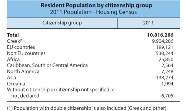
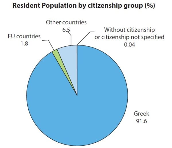
Like the earlier example, here also we need to pay attention to the largest and the tiniest numbers.
- Greek citizens are the clear majority in their country (both table and pie chart).
- The smallest citizenship group in Greece consists of people from Oceania.
- A miniscule percentage of Greek residents do not have a citizenship status.
| IELTS Writing Task 1 sample answer: |
|---|
| Introduction: The graphs display the number and percentages of various types of citizens living in Greece in the year 2011. Overview: To sum up, it is obvious that Greek nationals formed an absolute majority of citizens residing in Greece, whereas Oceanic people made up only a small fraction of total residents of Greece. There was also a tiny presence of residents without a specified citizenship in the country in 2011. Description: Out of the almost 11 million people living in Greece in 2011, over nine out of ten people, or around 9.9 million, were the citizens of the Greek state. It is interesting to note that although Greece is in the EU, the second largest group comprised of Europeans from countries outside the EU who stood at 530,000. Furthermore, less than 2,000 inhabitants of Greece were from Oceania. Finally, 6,700 people dwelling in Greece in 2011, or 0.04 percent of the population, were stateless. |
IELTS Writing Task 1 Describing Trends for Dynamic Graphs
WRITING TASK 1
You should spend about 20 minutes on this task.
| The bar graph below shows the rate of inflation in the developing countries of Asia and different regions of Asia in 2019 and 2020. Summarize the information by selecting and reporting the main features, and make comparisons where relevant. |
Write at least 150 words.
Inflation in developing Asia
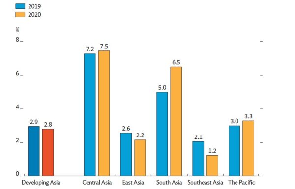
The graph gives information for two different years, hence it is a dynamic graph. Here, we have to focus on the change of the values over time. The increase or decrease in the rate of inflation from 2019 to 2020 is our concern in this graph. To revise the lesson about understanding different types of graphs, click here »
We can deduce the following key information from the chart:
- The overall inflation rate had dropped slightly from 2.9 percent to 2.8 percent.
- The highest rate of inflation was in Central Asia, where the rate had increased in 2020.
- The biggest changes happened in South Asia, where the rate of inflation had risen by 1.5 points, and Southeast Asia, where the inflation rate had fallen by 0.9 points.
| IELTS Writing Task 1 sample answer: |
|---|
| Introduction: The diagram compares the inflation rate in various parts of Asia between 2019 and 2020. Overview: In summary, while the rate of inflation had surged in Central Asia, South Asia, and The Pacific, it had declined in East Asia and Southeast Asia. Moreover, the biggest growth in inflation rate was seen in South Asia, whereas the largest fall had happened in Southeast Asia. Description: In both 2019 and 2020, the highest rate of inflation occurred in Central Asia with 7.2 and 7.5 percent respectively. However, it was in Central Asia where the most drastic change was seen as inflation rate had jumped from 5 percent in 2019 to 6.5 percent in 2020. By contrast, inflation rate in Southeast Asia had slumped sharply by 0.9 points to reach 1.2 percent in 2020. Altogether, the rate of inflation in the developing countries of Asia had diminished marginally by 0.1 points in 2020 from 2.9 percent a year earlier. |
WRITING TASK 1
You should spend about 20 minutes on this task.
| The chart below shows the GDP and GDP growth rate of Nigeria from 2011 to 2019. Summarize the information by selecting and reporting the main features, and make comparisons where relevant. |
Write at least 150 words.
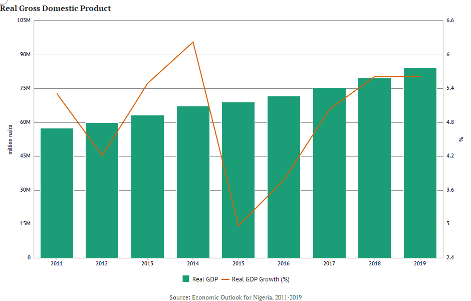
In this graph too, we have to analyze the trend of the movement of data. It is evident that the line representing Real GDP growth rate was erratic over the period. Meanwhile, Real GDP had a continuous upward movement.
| IELTS Writing Task 1 sample answer: |
|---|
| Introduction: The bar graph gives an overview of the real GDP of Nigeria between 2011 and 2019, and the line graph demonstrates the real GDP growth rate over the same time frame. Overview: To summarize, there was a gradual surge in the value of real GDP of Nigeria over the nine years. However, the rate of growth had fluctuated a great deal, with a noticeable setback in 2015. Description: The value of Nigeria’s inflation-adjusted GDP was slightly below 60 million naira in 2011. With a slow and steady rise in GDP over the next nine years, the value had reached approximately 80 million naira by 2019. Additionally, while the real GDP growth rate had dipped from around 5.4 percent to 4.2 percent between 2011 and 2012, the next two years had witnessed a substantial rise as rate of growth of GDP had peaked at about 6.3 percent in 2014. Though the rate had plummeted dramatically in 2015 to a trough of 3 percent, the following years had seen a continuous improvement. By the end, the rate of GDP growth had stood at about 5.6 percent. |
Vocabulary for dynamic graphs in IELTS Writing Task 1 Description
As we have seen multiple times by now, our answers for dynamic charts in IELTS Writing Task 1 questions should describe the increase or the decrease of data.
So we need to be armed with various ways of composing sentences to report change.
Verbs to describe an increase
| ascend | improve | shoot up |
| climb | jump | skyrocket |
| go up | leap | soar |
| grow | rise | surge |
Verbs to describe a decrease
| decline | dive | go down |
| descend | drop | plummet |
| diminish | dwindle | plunge |
| dip | fall | shrink |
Adjectives to describe no change
| consistent | fixed | steady |
| constant | stable | unchanged |
Adjectives to describe change
| Big change | Small change |
|---|---|
| abrupt | insignificant |
| considerable | marginal |
| dramatic | minor |
| major | minute |
| notable | paltry |
| sharp | slight |
Adverbs to describe change
| Big change | Small change |
|---|---|
| abruptly | insignificantly |
| considerably | inconsequentially |
| dramatically | marginally |
| rapidly | moderately |
| significantly | slimly |
| suddenly | slightly |
Next lesson:
Gaurav Thapa is an experienced instructor of English as a Foreign Language. He has eight years of experience teaching IELTS and PTE.